How to design custom gummy packaging that sells on shelf and online
Introduction
Design for gummies must do two jobs at once. On shelf, it must cut through visual clutter. Online, it must convert in a small thumbnail and in product descriptions. Great custom gummy packaging balances eye-catching design with practical features that protect product and support shipping. Here’s a clear checklist for designing packaging that sells both in stores and on screens.
Start with a clear brand message
What is the single idea your package should communicate? Is your brand fun and playful, premium and clean, or health-focused? Lock that down before the art phase. Custom gummy packaging that tries to be everything ends up saying nothing. A single, clear message helps art, typography, and finishes make unified choices.
On the product panel, state the one benefit loudly. Gummies that are vegan, high-potency, sugar-free, or artisan deserve that signal in the first 1 to 2 seconds of attention.
Visual hierarchy and typography for quick scanning
Shoppers scan, not read. Use a visual hierarchy that prioritizes brand name, product type, flavor, and format. Large, legible typography helps in both retail aisles and ecommerce thumbnails. Avoid decorative fonts for key information. Keep the most important words big and bold.
Online shoppers see a small image first. Make sure the brand and flavor remain legible at thumbnail size. That’s where custom gummy packaging design loses or wins clicks.
Color, imagery, and sensory cues
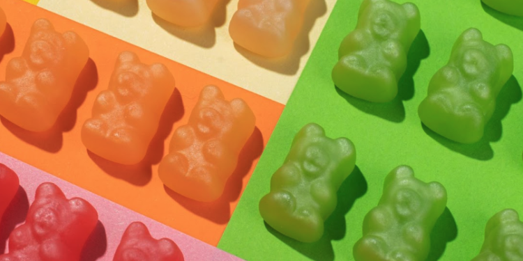
Color drives emotion. Bright, saturated colors suggest candy and fun. Earth tones suggest natural or functional gummies. Use photography or illustrations to show the product when appropriate. A small transparent window can show real product texture and color, but only when it does not compromise barrier needs.
Textures and finishes also signal quality. Gloss can suggest freshness and vibrancy. Matte gives a premium feel. But finishes must be compatible with barrier films and printing processes chosen for custom gummy packaging.
Packaging form and online convenience
Resealable stand-up pouches are efficient in fulfillment and attractive on shelf. They ship flat, photograph well, and provide a large branding area. Rigid jars photograph nicely and convey giftability or premium positioning, but they add weight and shipping costs.
For online, consider how packaging looks in a product bundle or in a subscription box. A compact, stackable pouch often produces better freight economics and a cleaner photo. Think about pack size variations and how they appear in hero images.
Labeling and compliance that sell trust
Online shoppers can’t hold the product. They rely on labels for safety and credibility. Make sure nutrition, certifications, and ingredient lists are clear and easy to read in both thumbnail and full-size images. Add icons for quick scanning: vegan, gluten free, non GMO, or certified organic.
Include a visible best-by date or batch code. That transparency builds trust and reduces hesitancy in online purchases.
Unboxing and secondary packaging for surprise value
The unboxing moment matters online. A nicely designed inner pouch, thank-you card, or a peel-back sticker creates shareable moments and increases the likelihood of social mentions. Custom gummy packaging should consider what customers find delightful and useful after they open the primary pack.
If you sell subscriptions, durable resealable pouches that survive multiple shipments reduce complaints and make the product feel reliable.
Photography and mockups for ecommerce
Great package design is wasted without strong photography. Create clean hero images, lifestyle shots, and close-ups of texture. If you use a window, show both filled and empty views. Provide white-background images and contextual photos for social media.
Optimize images for common ecommerce sizes so your typography and logo stay legible. Test thumbnails in your store layout before finalizing design files.
Retail-ready considerations
Retail shelves require barcodes, net weight, and legible nutrition panels. Make sure those elements do not conflict with visual brand elements. If you use a window, ensure it does not obscure required information when the pack sits on shelf.
Consider pack orientation and how it stacks on pallets and shelves. A consistent face-out layout helps with visual merchandising and replenishment.
Sustainability as a design asset
If your packaging is recyclable or made with PCR content, make it part of the design story. A small badge and a short line on how to recycle can influence eco-conscious shoppers. But be precise. State what to do with the packaging after use.
Sustainable design choices can also affect color and finish, so coordinate sustainability goals with print and material specs early.
Conclusion
Design that sells blends clarity, brand voice, and practical function. Custom gummy packaging should lead with a single message, use strong visual hierarchy, and be validated for both retail and ecommerce contexts. Match format to fulfillment needs, make compliance visible, and invest in photography that shows the product honestly. Do these things and your packaging will not only protect the gummies but also convert browsers into buyers on shelf and online.